Why Responsive is the Way to Go
 Have you ever made your way to a website with something you’re interested in buying, but as soon as you attempt to click through the display isn’t properly formatted? Have you tried to get onto a site that wasn’t mobile optimized and experienced all sorts of functionality and display problems?
We’ve all had web experiences like the ones described above. And if you’re like most people, the first thing you do once you’re having these issues is navigate away from that page.
The issue of web responsiveness is an important one to consider within your own website design and marketing. And failing to keep your site functional for all users will inevitably lead to many missed opportunities, upset customers, and lost sales potential.
Let’s get to the heart of the issue of responsive design so you can understand why it’s so important and what you can do to keep your own website zippy, aesthetically pleasing, and user-friendly.
Understanding Responsive Web Design
 To put it in simple terms, a responsive web design paradigm allows your site to dynamically change its layout depending on the screen size and device which is being used. For example, wider screen laptops or computers can show multiple rows with columns for viewing. When viewed on a mobile device, however, these columns are clunky and hard to see. Responsive design prevents this by providing proper displays that will scale to be easy-to-read no matter the size or shape of a screen.
Why Should You Care About Responsive Web Design?
Many businesses have neglected making the shift toward a responsive model in their websites. Instead, they opt for a dual mobile and desktop approach that directs users to each respective site depending on the detected device. Here are two powerful reasons why this is a blunder:
1. More Work to Upkeep Multiple Sites: If you’re keeping up with a mobile and a desktop site, you’re giving yourself twice the work! It will ultimately cause a lot more stress for you.
2. Increased Risk for Misinformation: Updating two sites could accidentally cause a mistake which creates misinformation between the two. Additionally, your mobile customers may want to find information that’s only available on the desktop site which will confuse them even more.
Rather than continue with this outdated method for site compatibility, responsive web design simplifies it. In many cases cloud-based resources mean that you can quickly and easily make adjustments behind-the-scenes without interrupting your user experience. Visitors will still enjoy an easily visible web design without the need for you to upkeep two sites simultaneously.
Responsive Design and SEO
 As you probably already know, Google has not been shy about noting the importance of mobile
optimisation within their search engine rankings. If you don’t have a mobile site at all – or if your mobile leaves much to be desired – now is the time to make the switch toward responsive design. If not, you’re losing out on even more potential customers.
Redman Tech: Even More for You
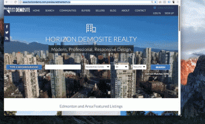
Does your slower or outdated website need a bit of help? Do you need to improve your lead conversion and boost your overall user engagement with a responsive web design model?  We offer fully responsive website themes with all of our Redman Pro packages to ensure that your site meets and exceeds current standards. Today’s Internet marketing climate can pose significant challenges – especially in the ultra-competitive real estate market. Why not let Redman Tech help?
Our team was born-and-bred within the real estate industry to provide you proven results in website development, marketing, and everything in between here in Canada. Contact us today to learn just how much further we can help take your business.
Sign-up For FREE Updates