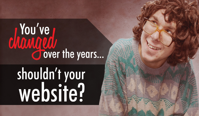
“Your website loves you. It’s time to change your ways.”
We want to say we’re sorry. We’re sorry because, for so many days now, our product ambassadors have been calling, and we know that we give you stress when we do.
We don’t mean to. We’re just looking out for your Real Estate website.
And most of you totally understand that. We know that when you say, “I’m too busy to look at that right now,” you mean it.
So we wanted to share a few key signs that you can’t look away from. These are the ‘must change’ elements that should make it to the top of your list because they are affecting your business.
“You have a promotion on your main page from the era of the dinosaurs.”
Contact information and promotions are outdated or inaccurate.
It’s important to remember that a website is not a business card. They haven’t been like that for nearly 15 years. We have to stop thinking that a website can be a “set-it-and-forget-it.” Your website is the best way for you to expand your reach to clients and prospects, and it’s an easy way for them to get in touch with you.
“You look more like a high school grad in your photos than a REALTOR®.”
Images on your site are out of sync with your professional message.
If you have outdated images on your site, how are people supposed to know who you are? Worse, what do you think your clients are thinking when they see that? It’s critical to reveal the kind of professional you are, your approach and your defining unique qualities with the help of a professional photographer. Start with one image, and see where it takes you.
“Your website is playing hard to get—with your clients.”
Website widgets and outdated technology slows page load times, frustrating visitors.
At one time those widgets, plugins, flash and things seemed like a good idea. But as time goes on, they cause compatibility issues if they are not updated or removed. Simplicity is the new sexy thing, and those old plugins and options on the site slow down page loads. A website that takes too long loses visitors, and a real estate professional that loses visitors is losing business.
“Your content is not from this century—literally.”
You still have the original stock content on your website.
Back in the early days, it was totally acceptable to be using—and keeping stock content. It was a different era, Google was still a young search engine competing with Netscape for the crown. And people were happy just to be browsing. No one cared if everything read the same, we had pictures on the internet! Now Google owns all, and it doesn’t take too kindly to old stock content. Furthermore, people actually want to know what you’re about, since they can pretty much decide if it’s you they pick or the next guy. Don’t give away your prospects.
“You’re ‘anti-social.’”
You have no social media activity on your website & you’re not active on social media.
Social media remains one of the best places to gain ground as an expert, build rapport with prospects, and connect and manage clients. At the very least, make it easy for others on social media to share your stuff by putting share buttons on your website, and that includes static landing pages and blogs. Remember: Clients want to check up on you and learn more about you. And what they think about you matters. Everyone’s online somewhere. Find the social channels that resonate with you and get out there.
“If someone uses their tablet, they’re ignoring you.”
Your website isn’t optimized for multiple devices, and this prevents people from converting.
Want to know something motivating? In 2012, over 50% of the world’s internet browsing was done on some form of tablet or other mobile device. Phones and tablets have taken over. Period. Just last week, one of our team updated their tablet to a new iPad Mini, and we were amazed at how many REALTORS® don’t have websites optimized for multiple devices. One of the first things people do when they’re driving around looking at properties is look back at the listings online through their device in the car. Our GPS searching options make it easier for prospects to look at listings based on where they are the minute they’re where they want to be. Coupled with our tablet view options and custom headers, there is absolutely no reason why you should be letting great leads slip away from you.
We know, some of these thing sound like really big changes. We also know you’re busy and it’s not our job to scare you here. In fact, the reason we wrote this is to tell you that you don’t have to do everything at once.
But you do have to start.
It’s never too late to start making changes once you’ve identified the problems. You can keep working away at each of the issues over time until eventually, you get there.
That’s what we did.
At one point, we took a look at our online presence, and we were ready for an update. If we can do it, you can do it.
The results will pay back in droves, just as it is for us. We want you to be able to experience the benefits of having a strong online presence, too. At the end of the day, this is about you and your business.
We’re here to help. Let’s have a conversation about what we can do for you today, so you can get the results you—and your website—deserve.
Sign-up For FREE Updates


