We like working with REALTORS® that have a strong vision of who they are and what value they bring to their clients. That is why working with Edmonton REALTOR®, Donna Van Lier-Grieve was so great! Donna has been a Redman client for years. Put it simply, Donna is good people. There are a lot of lessons other agents can learn from her brand new Redman website, so I compiled 3 points that every agent should consider when they are considering a website of their own. Let’s begin!
1. Show Value First
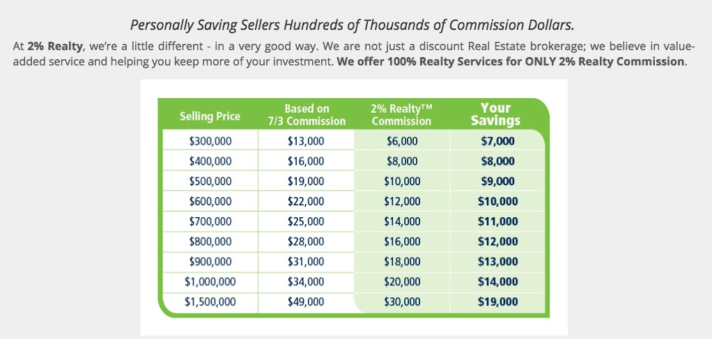
The header on her homepage has a built-in button linking to an image that displays how much Donna’s clients can save by working with her. As far as a marketing strategy goes, this is very smart. Donna knows that visitors to her site are probably shopping around for REALTORS® and she chose to display her value right off the bat. Smart move, Donna!
Have a look at Donna’s header:
 And here is the where the visitor is taken to once they click on the “See How Much You Can Save” button in the header:
 2. Be a Know-It-All
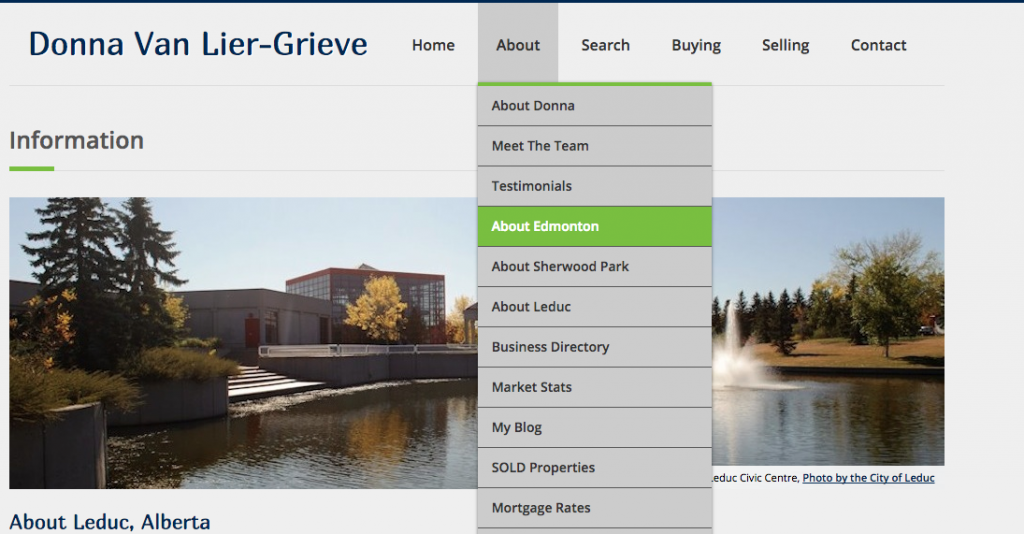
As a REALTOR®, you want to become a trusted knowledge-base for your clients. Donna’s landing page for people moving to Edmonton is a great example of this idea. It has just the right amount of text to pique their interest, and the contact form is large and looks easy to fill out. What’s more, Donna has three local information pages about the areas she does business most:Edmonton, Sherwood Park and Leduc. Her website is a helpful source of information for anyone interested in learning more about those areas mentioned above, and what’s even better is that the information is completely free. Again, she is demonstrating her value as a trusted agent.
An image of the menu bar that contains 3 local info pages:
3. Provide Opportunities for clients to spread the word
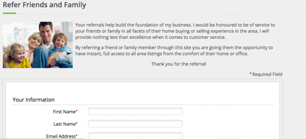
Donna’s refer-me page is a perfect lead capture opportunity that can be used in a variety of ways. For instance, she can add the refer-me form to her electronic signature (in the form of a link). And, as you can see from Donna’s quote above, her home evaluation widget on the homepage is getting her some hot leads!
Here’s a screen shot of Donna’s refer me page:
And after launching the site, Donna had this to say about working with Redman:
Thank you! I want to say that I am ecstatic with the new website and the service from you and Redman – Donna
We loved working with Donna too! Thanks for reading – Sabrina
Get in touch about your own Redman Pro Level site today!
Have you seen our inspiration gallery?
Sign-up For FREE Updates


