Have you ever arrived at a restaurant with such an impressive menu choice that you don’t know what to order first? Well, that is exactly how I feel about sharing our most recently launched Redman Custom website. There is so much to share that I don’t know where to start. So, I thought I would share 3 things about this custom project overall that made it a stand out for me.
1. Team Core
A few words about the team, saying that they pay attention to detail is an understatement! And we love that. When clients have a clear vision of who they are and what they want, it makes working on their project all the more enjoyable. And looks like the feeling is mutual, as we got this sweet message from Michelle from Team Core a few days after the site was launched:
Thanks so much for all your help and your ongoing patience with us as we ‘knit pick’! You guys have been amazing to work with and I cannot express how happy we are with the final product and our new site. –Michelle McMurdo, Team Core
2. Hover Effect
Since a major part of Team Core’s marketing is based around who the team is and what unique quality they can bring to each Real Estate transaction, using the hover effect to showcase what the team is like in and out of the office was important. When was the last time you saw a broker owner in this light?


See the rest of the team here
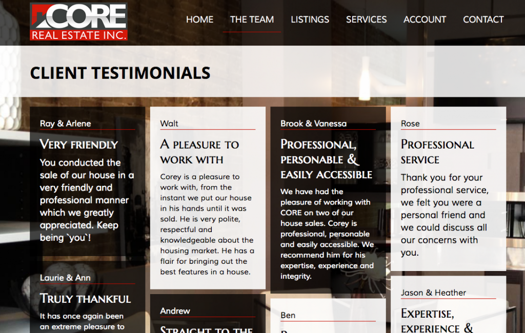
3. Testimonials Page
Team Core’s client testimonials page speaks volumes. On this page, Team Core is really letting their clients speak for them.
See Team Core’s testimonial page here
Take a look through Team Core’s website and experience their vision first hand here.
Interested in see more Redman Custom websites? Visit our Custom Websites Gallery here.
Sign-up For FREE Updates


