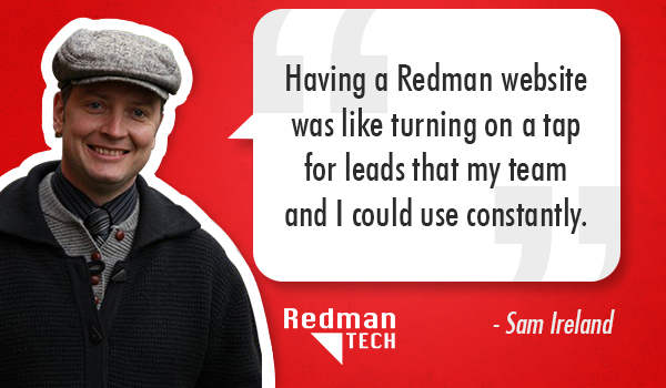
 Edmonton REALTOR® and long time Redman client, Sam Ireland wears many hats both literally and figuratively.
Quite literally, on any given day, Sam can be seen wearing one of his wardrobe staples: a paperboy cap. In fact, we’re not sure if we would recognize Sam without it! (If you have seen the website, you will notice that Sam’s cap was a big inspiration during the website re-design).
Figuratively speaking, in addition to be a Real Estate pro (11 years in the making), Sam is a loving father of three, husband to his marketing savvy wife, Kimberly and a REALTOR® with strong old fashioned values. Sam puts a lot of care into what he does and it shows.
“I chose Redman because they keep it personal and they’ve kept the family business feel as they’ve grown.”– Sam Ireland
Sam gave us a unique vision to work with. He wanted the new website to give an old fashioned newspaper feel that showcases how important family is to him. Needless to say, our creatives got excited.
 Without further ado, here are 3 things we are loving about Sam’s website:
1. Branding is not an afterthought
Sam has built a successful over 11 years based on some basic values that he prides himself on. That has become his personal brand and it’s what sets him apart from competitors. Naturally, the website reflects who Sam is and what value he offers when you work with him. Take a look at his header image and logo. You’ll see a cap and his slogan “Let Our Family Look After Yours.”
The takeaway for REALTORS® considering a site refresh:
Your branding and marketing does not have to be complicated. Keep it simple.
2. Shows the big picture
Sam’s site is fully responsive which means the website resizes to fit the screen of a tablet for instance and it is mobile friendly. So pull out your smart phone and view the site, you’ll see what I mean. Since 90% of homebuyers use the internet during the home buying process*, why not make it easy for clients and potential clients to get the information they need, regardless of what device they are using?
The takeway for REALTORS® considering a site refresh:
Having a fully responsive website increases your exposure and raises people’s perception of you. If you’re into raising the bar, think about our Redman Pro platform for your business.
3. Give a litte,Get a little
Sam chose to have a widget that encourages users to fill out a form for the mortgage pre-qualification purposes. By encouraging users to get in touch with his mortgage specialist, not only is beefing up lead generation potential right on his homepage but he is also highlighting what else he offers.
The takeway for REALTORS® considering a site refresh:
Being a useful resource for your clients will go a long way in building long lasting client relationships.
The best thing about working with Sam? He did not budge from his vision. And we’re glad he didn’t. You can see his recently launched website here
*Sources:Digital House Hunt
Want to read more?
6 Reason We Love Responsive Design
Want to submit a Redman Customer Story? Fill out this form, we would love to hear from you!
Sign-up For FREE Updates


